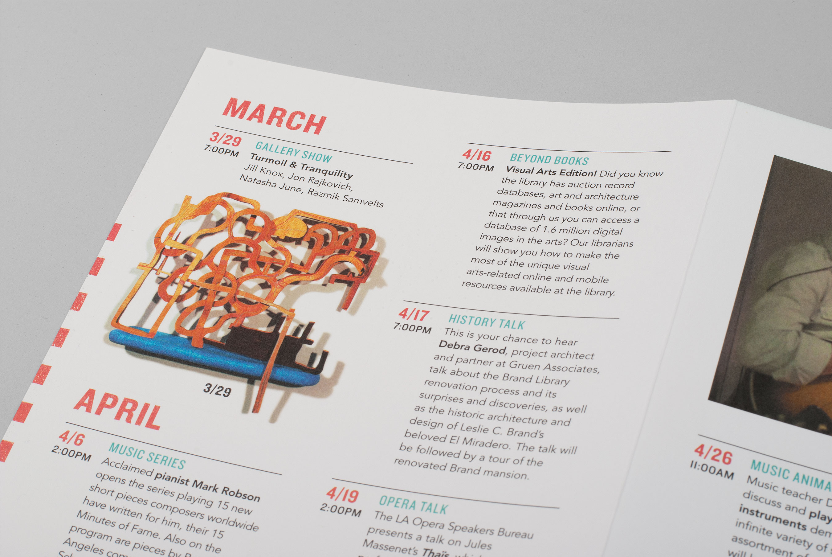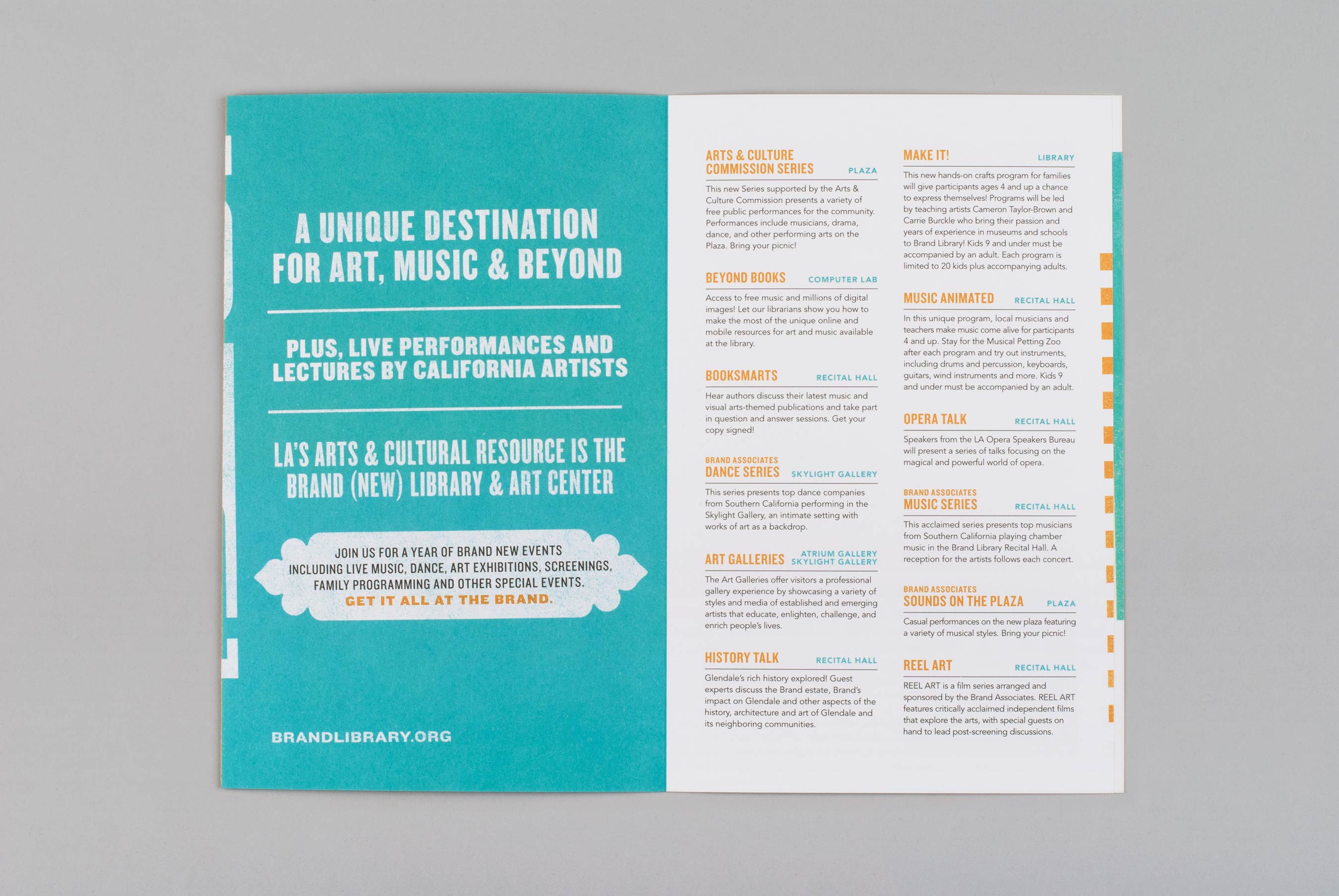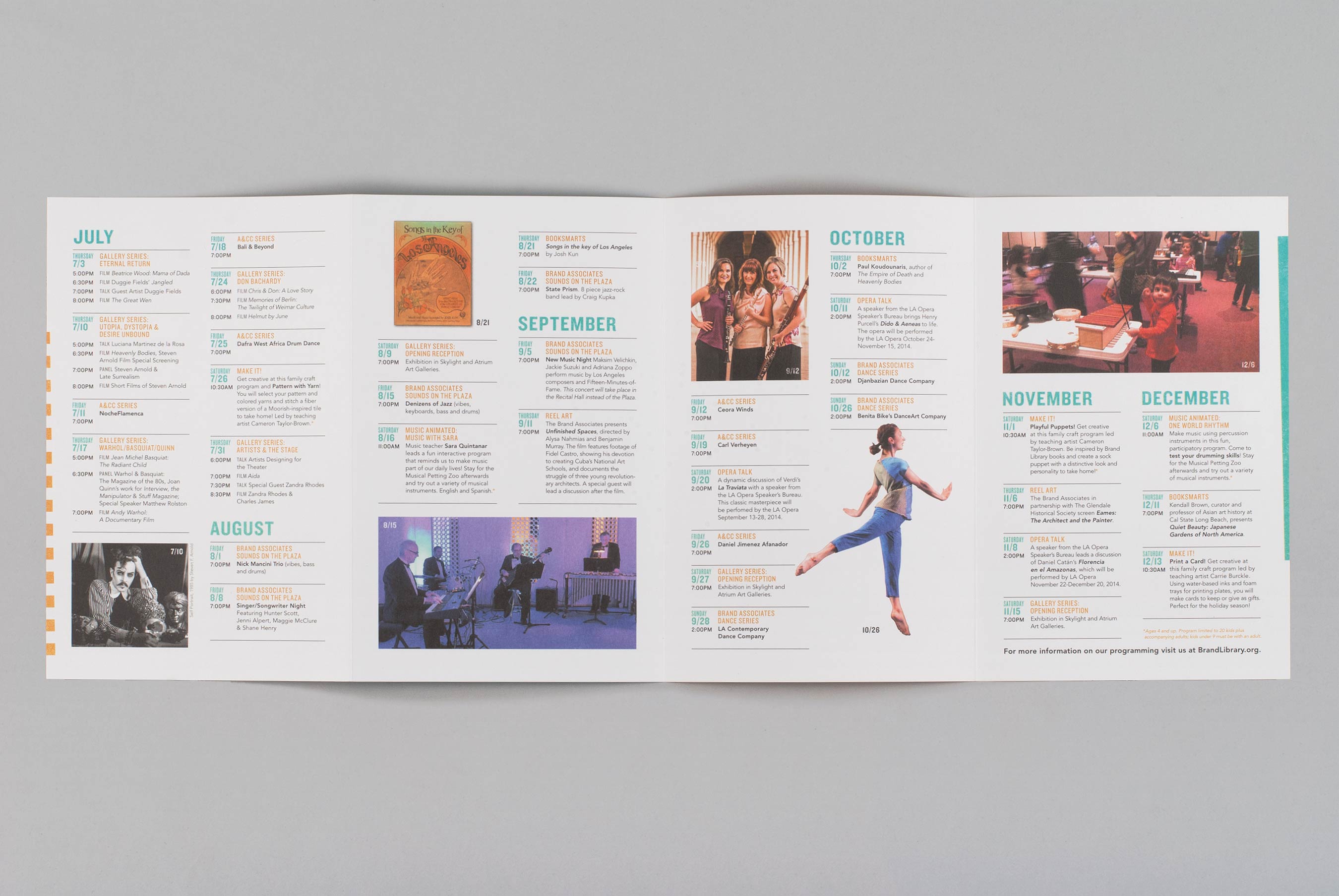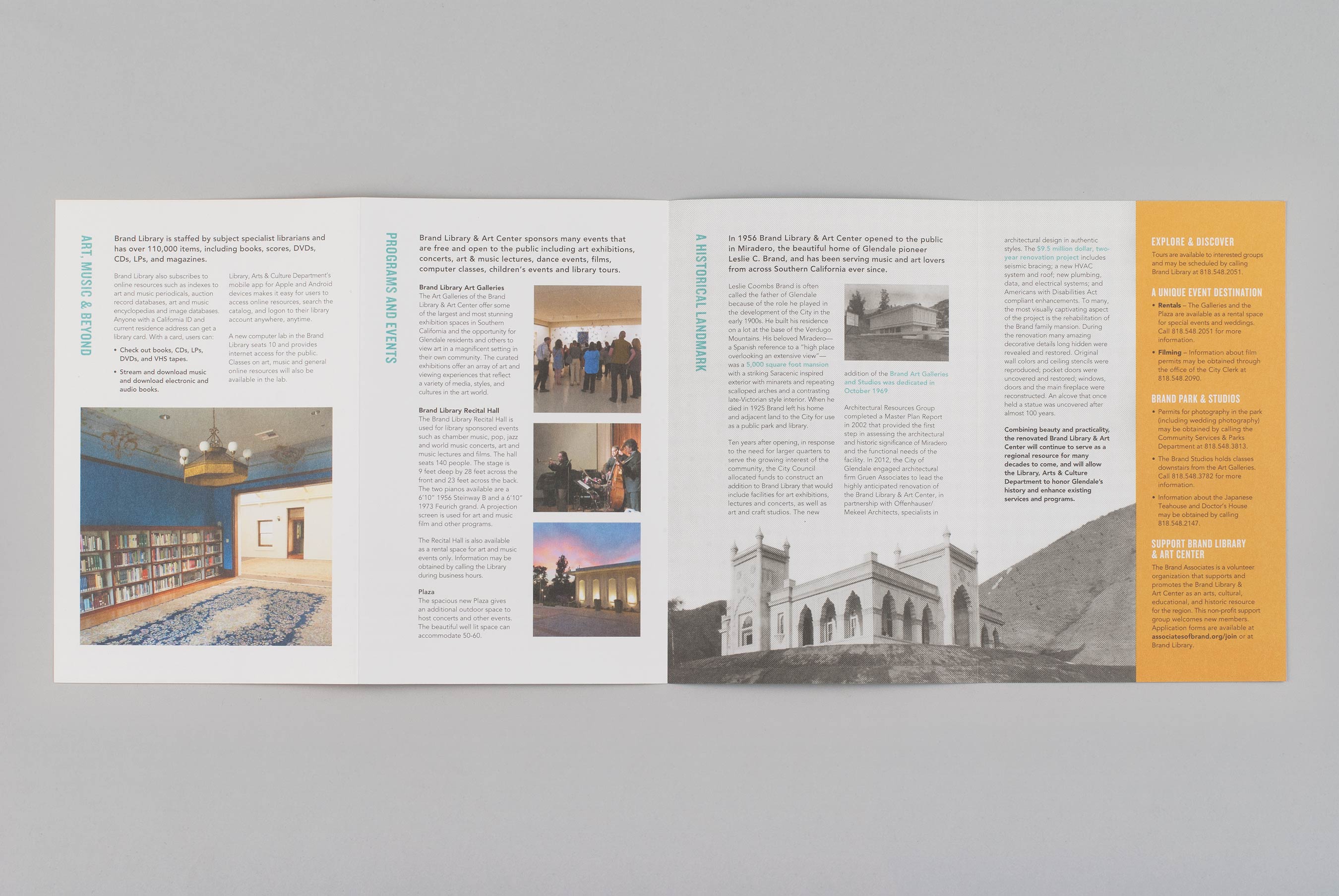


Brand Library & Art Center
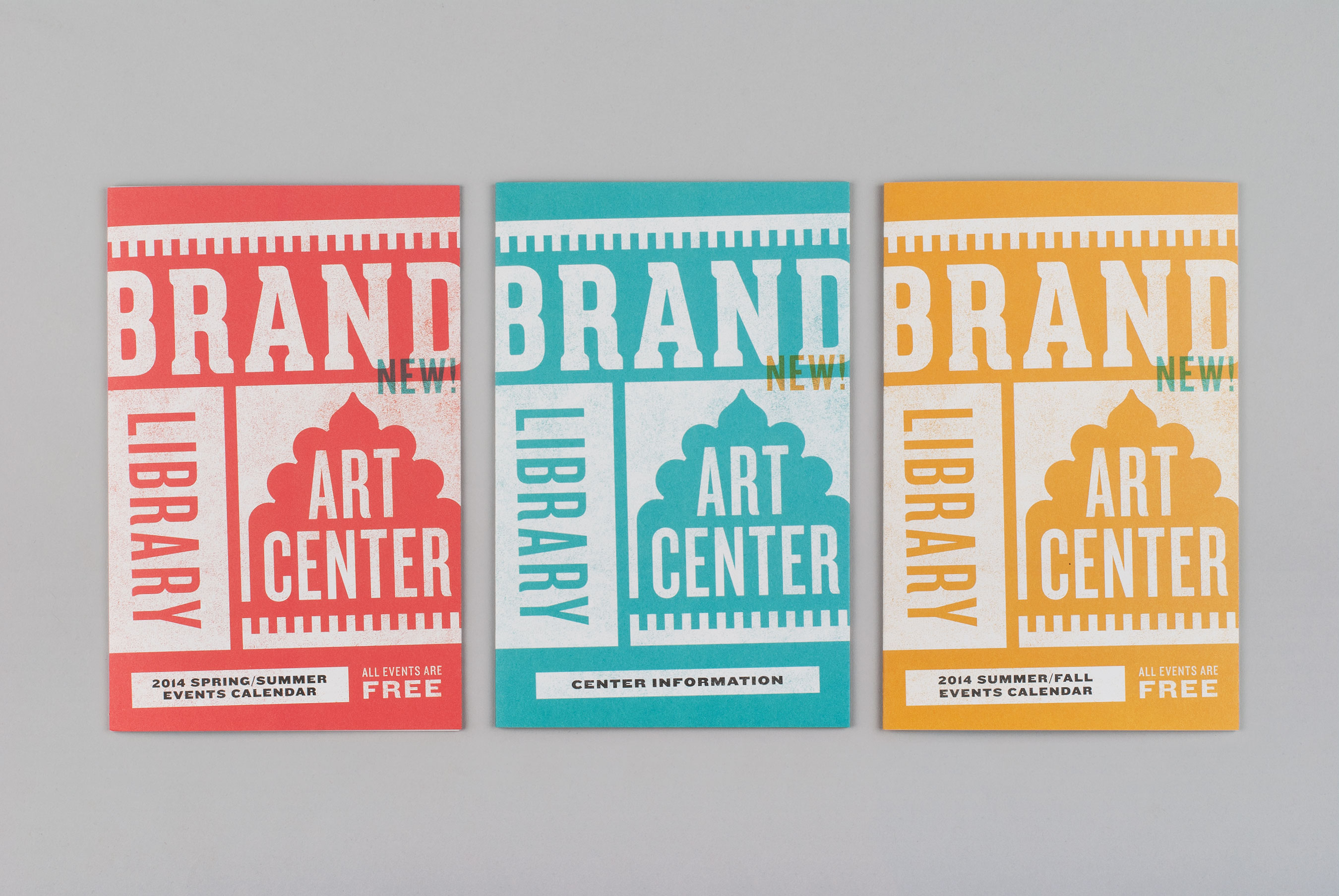
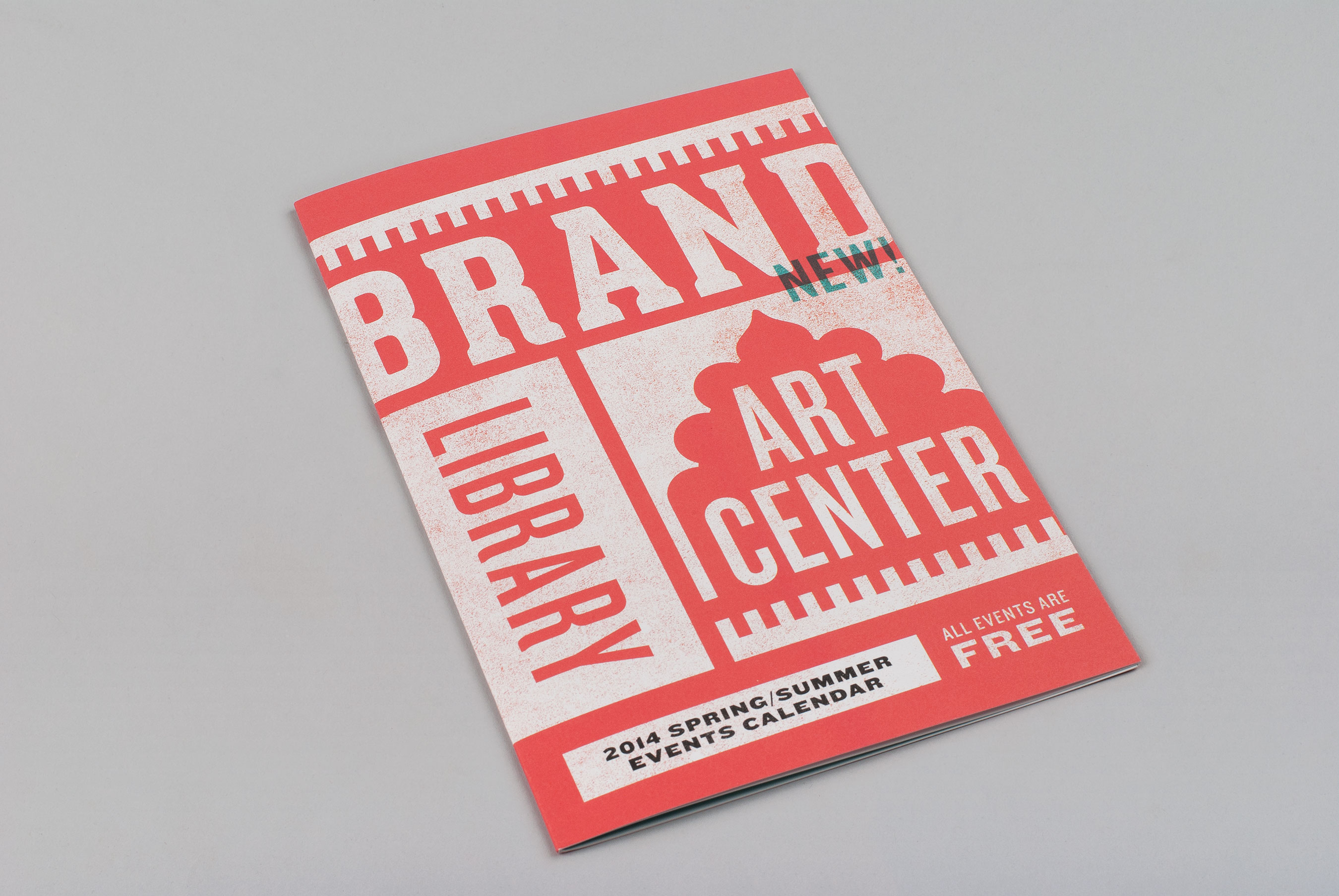
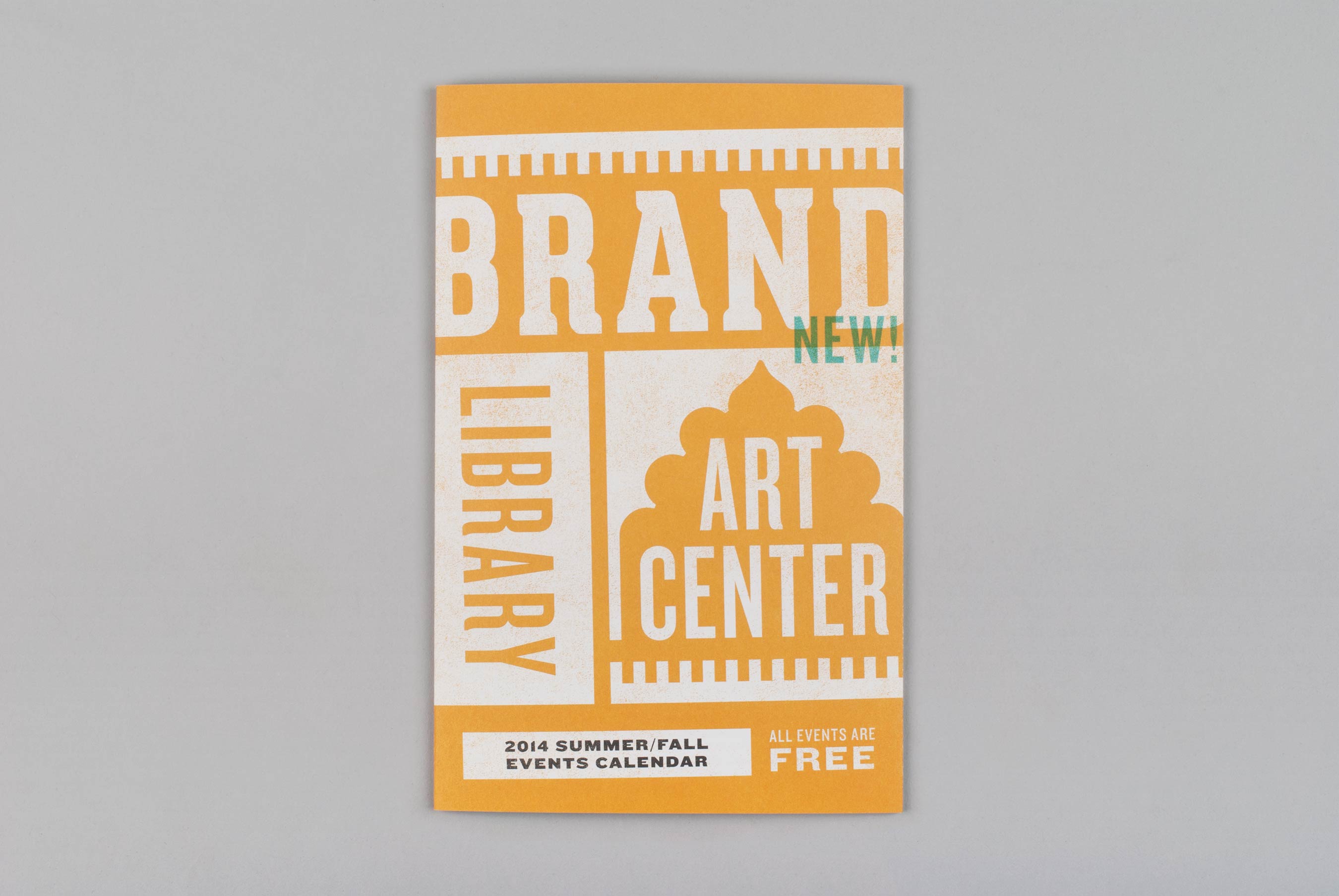
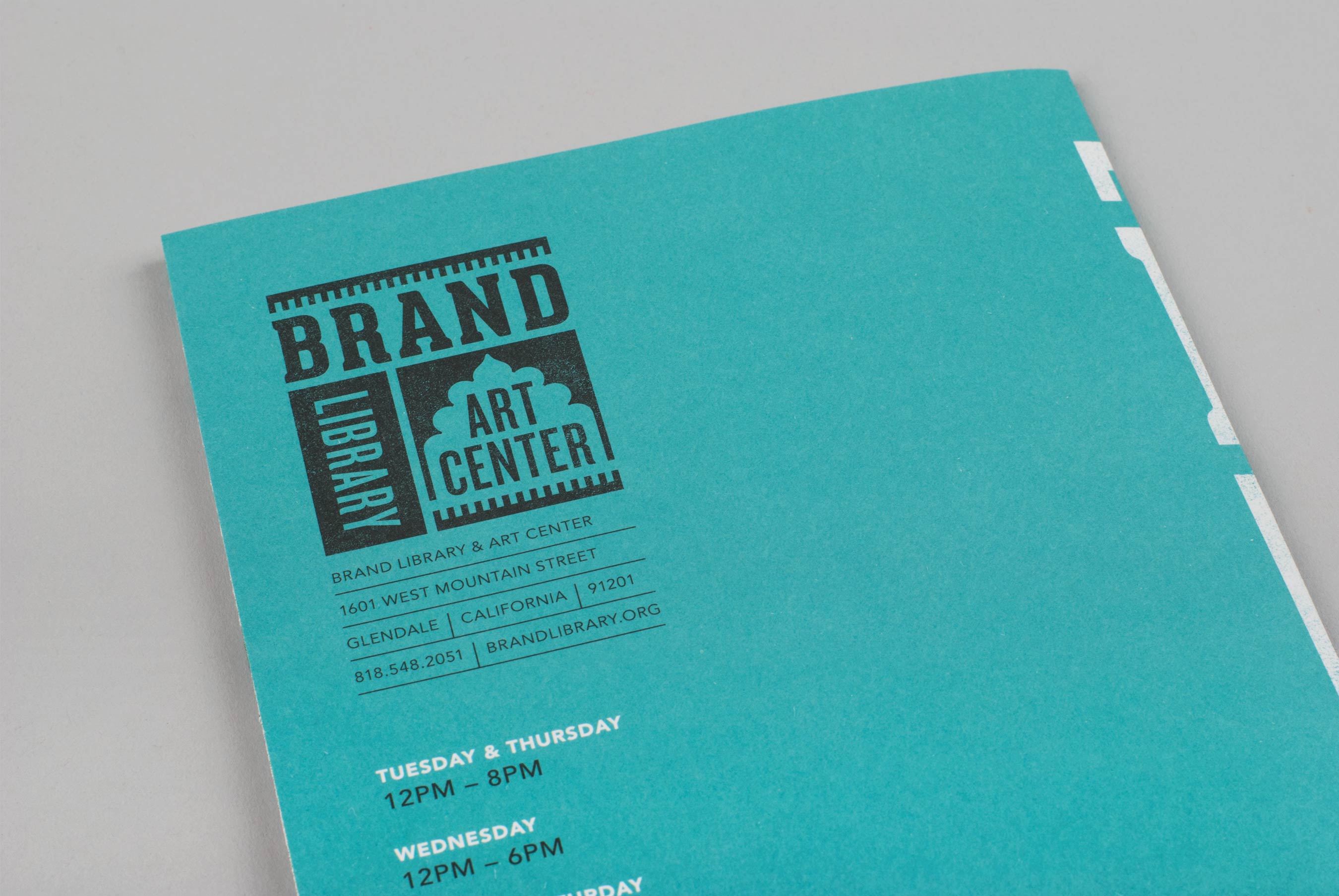
The Brand Library and Art Center is a Los Angeles landmark—a historic gem loved for its unique architecture, picturesque locale, and the best collection of music and fine art books in the city. Driving uphill to the property guests are greeted by an impressive white archway, a design motif that’s repeated throughout the campus, and what inspired our design for the new identity.
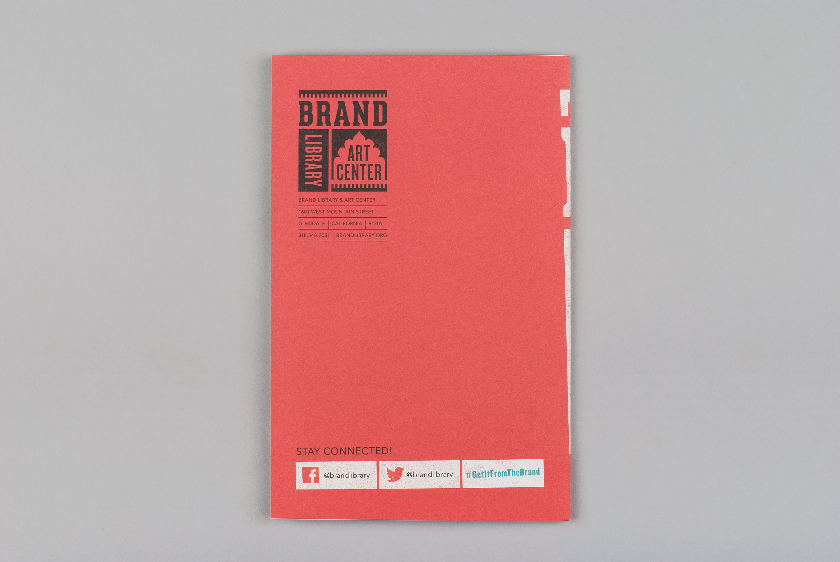
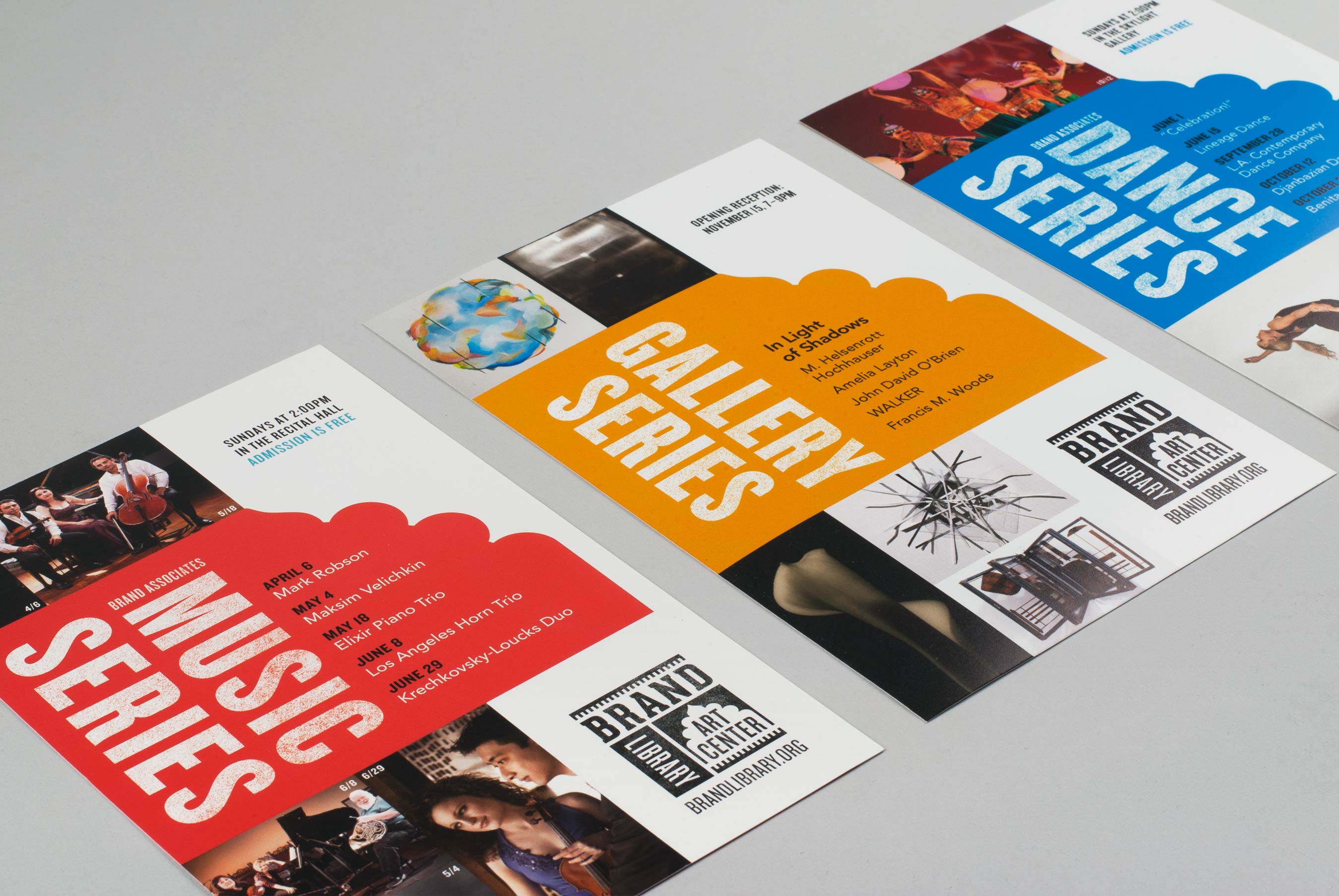
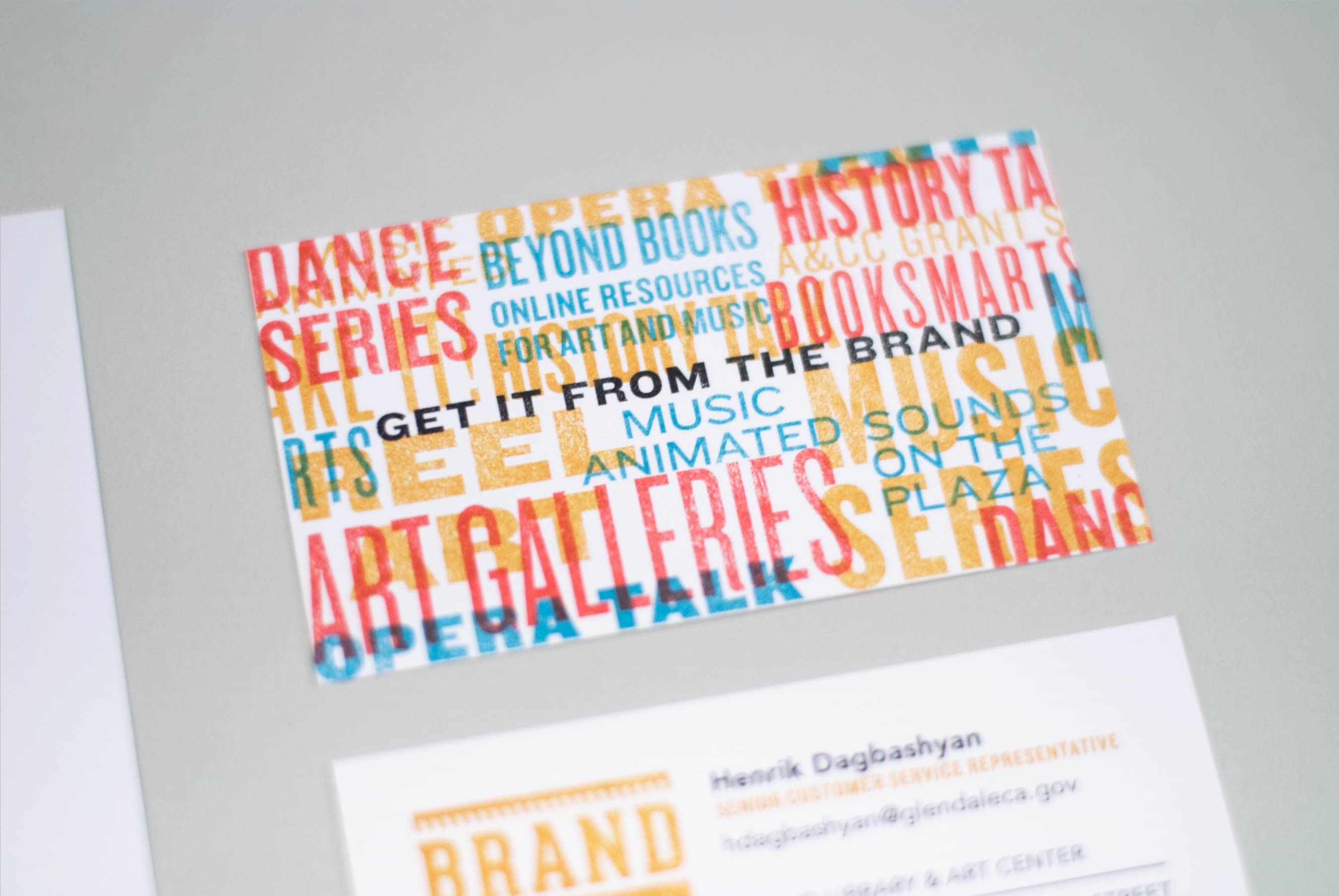
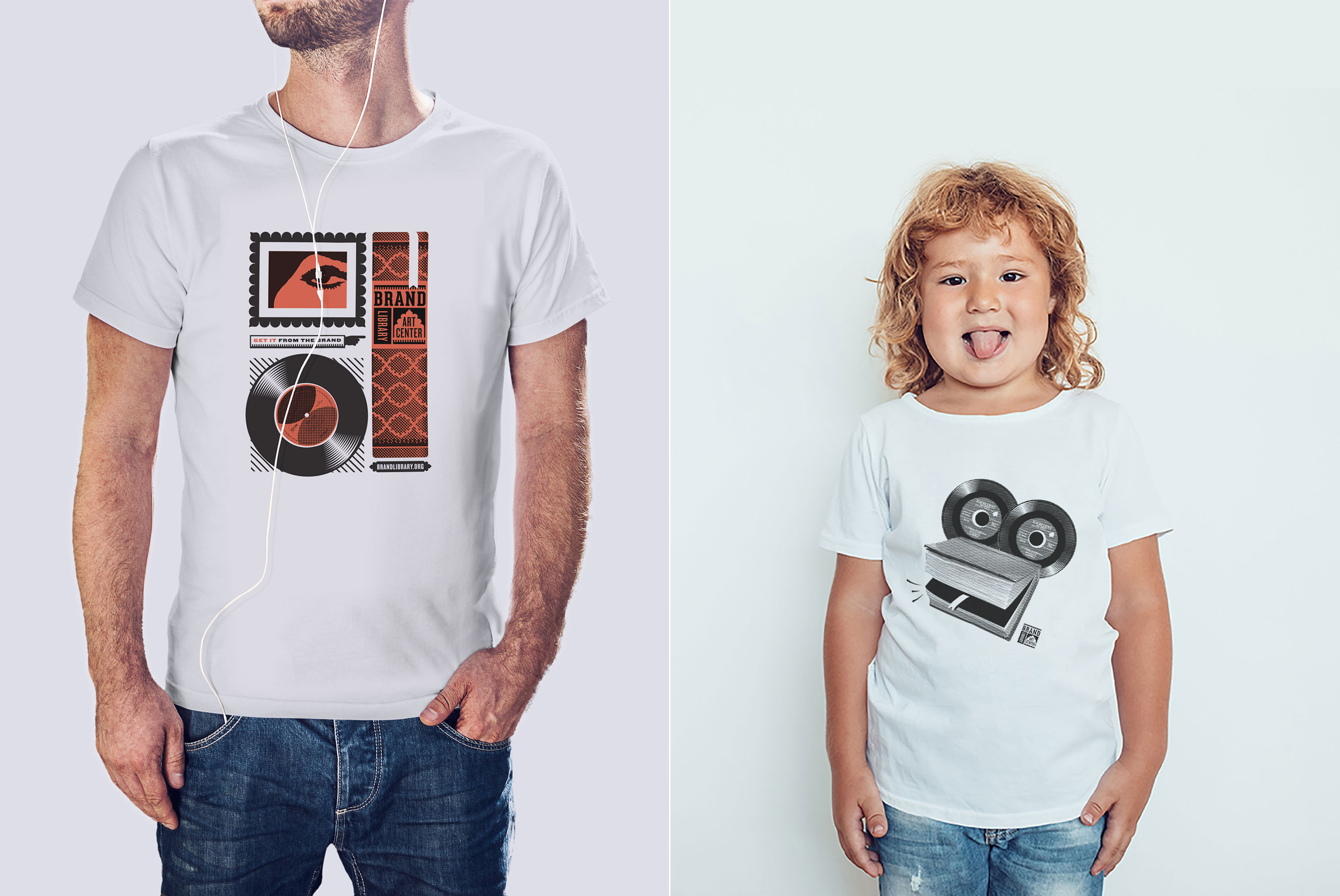
The Brand was closed for 2 years to undergo an immense renovation that modernized the communal spaces and restored the historic architectural details. Our new branding system celebrates the contrast of old and new with a bold color palette inspired by the library’s interior design, set against a crisp white mottled texture to reference the building’s plaster exterior. The logo highlights the Brand’s iconic architecture and creatively unifies the the two main functions of the Brand: the library as represented by the book spine, and the art gallery represented by the arch that frames the typography. The logo is always used at a slight angle as if stamped—a feature designed as a subtle nod to the stamping system historically used by libraries. This style coupled with the distinct shapes pulled from the new logo form the graphic foundation used to design all of the Brand Library & Art Center collateral.